Introduction
Image Wipe Magic is a Dreamweaver application that employs an image mask to display and hide parts of two overlapping images and inserts the relevent markup into an HTML page. The user can specify more than two images in the UI to create an interesting type of slide show, as the images transition during the repetitive movement of the image mask. The following wipe effects are presently deployed.
- Vertical -- Like a window blind where the pull bar is perpendicular to the bottom window sill.
- Horizontal -- Just like a window blind
- Diagonal -- Similar to the previous two effects by the swipe is done diagonally
- Circle -- A circular transition
- fadeTo -- A fading from one image to another
- Square -- A transition in the shape of a square
- Octagon -- A transition in the shape of an octagon
- Explode
- Cloudy
- Random -- A random ordering of the first seven effects above
Installation
This application is installed into Dreamweaver by downloading the RB_ZP.zxp file and installing it using the Dreamweaver CS6 Extension Manager, or a similar extension manager. (Users can get an RB_ZP.mxp file for ealier versions of Dreamweaver and use their particular version of the Extension Manager to install it.)
Using the App
Once the application has been installed into Dreamweaver, place the cursor at the spot in your document where you want the markup to appear and click on the icon,  , in the Goodies panel, or by selecting Insert -> Goodies -> ReB Image Wipe Magic and make your selections in the UI. Upon clicking the OK button, markup will be placed at the position of the cursor and links to the required support files (.css and .js) are inserted into the HEAD section of the document. If the cursor is placed in an existing instance of IWM, the UI will display a Remove button so that it can be removed from the document. At least two images must be specified, but more can be specified if desired.
User Interface (UI)
The following figure shows the UI for a new instance of IWM
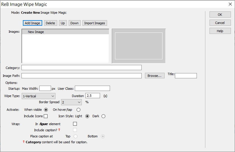
Fig. 1 UI for new instance of IWM
The top half is where the user selects the images that he/she wishes to use. As mentioned before, at least two images must be selected. If more images are choosen, the remainder are used for a 'slide show', where each one appears in an animation after the selected effect has made one iteration and if the When visible Activate button has been selected. The other Activate button allows the effect to become a transition that is initiated on hover or a tap, on a touch enabled machine. In this case, just the first two images are used. If the user wants to make use of animation, then all images should be about the same size as this will avoid having to download oversized images. If the Title field is not filled in, then one based on the image's filename will be created and used. All animations are setup to begin when they become visible in the viewport. The user can also choose to have Pause/Play Icons, in either a Light or Dark style, shown for animated sequences. Animation is not possible if the second Activation button, On hover/tap is selected.
The User Class field is for the user to specify his/her own styling rules for the border around the images, which will completely replace the rule now being used:
.imgDsp {
     	border: 8px solid #eee;
	     -webkit-box-shadow: 1px 1px 3px rgba(0,0,0,0.75);
     	box-shadow: 1px 1px 3px rgba(0,0,0,0.75);
}
A value must be given to the Max Width field. This value, in conjunction with the aspect ratio (width-to-height) of the displayed image, based on its intrinsic size, is used to determine a min-height setting for the container.
At the bottom of the UI, the user can elect to have the IWM container placed in a figure element, along with a suitable caption. If a caption is selected to be used, then the content of the Category field is used for the caption content. The caption can be placed above (Top) or below (Bottom) the image in the figure element. (These denote where within the figure element the figcaption element is positioned.) If the user wishes to make changes to the css related to the figure element, he/she can do so by changing the style sheet directly or, as is highly recommended, create an exception style sheet that comes after the one included with IWM and which will over ride its rules.